

Cup and Handle Pattern Explained: The Base, the Handle & the Breakout (Beginner's In-Depth Guide)
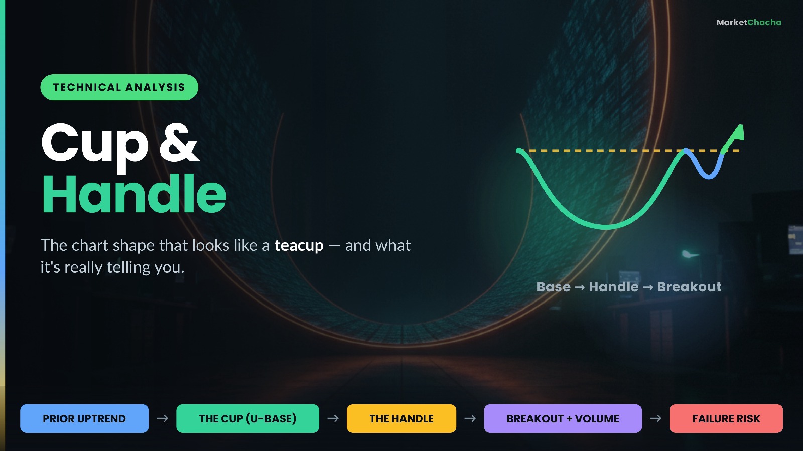
A cup and handle is a chart pattern in which a stock's price forms a rounded, U-shaped base (the "cup"), then drifts sideways-to-lower in a small, shallow pullback near the top of that base (the "handle"), before attempting to break out above the level where the cup began. It is classified as a bullish continuation pattern — a pause inside an existing uptrend rather than a reversal of a downtrend. It was popularised by William O'Neil, who described it in How to Make Money in Stocks as one of the classic bases that leading stocks form before a new advance.
This guide walks through what each part of the shape actually represents, how traders measure a target, what separates a well-formed cup from a badly-formed one, and — just as importantly — where the pattern fails and why it is a description of behaviour, never a promise about the future.
The anatomy: what the shape is made of
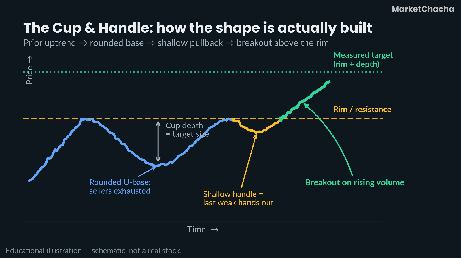
Every proper cup and handle has four parts, and they must appear in order:
- A prior uptrend. Because it is a continuation pattern, there must be something to continue. Typically the stock has already advanced meaningfully before the base begins.
- The cup. Price rolls over from a high, declines, spends time grinding along a bottom, and then recovers back toward that same high. The key word is rounded — it should look like the inside of a teacup, not a sharp V.
- The handle. Near the old high, price stalls and drifts modestly lower, usually on quiet volume, for a short period. It is a small pullback, not a second crash.
- The breakout. Price pushes above the "rim" — the resistance line drawn across the two highs on either side of the cup — ideally on a clear expansion of volume.
What the pattern is actually telling you
Shapes on a chart are not magic. They are pictures of supply and demand changing hands, and the cup and handle tells a fairly readable story.
The left side of the cup is distribution: buyers who bought the highs are now underwater, and every bounce meets people trying to get out at breakeven. The rounded bottom is the important part — a slow, gradual, sideways-ish low means selling pressure is fading out over time rather than being flushed in a single panic. A sharp V-bottom means price never spent time absorbing supply; it just gapped from fear to hope.
The right side of the cup is accumulation: buyers are willing to pay progressively more, and the stock walks back to its old high. The handle is the final test. As price nears the old high, the last of the trapped, breakeven-desperate holders sell into it, plus short-term traders take profits. If the stock only gives back a small amount and volume dries up while it does, that is the tell — supply is genuinely thin. The breakout is what happens when demand finally has nothing left to absorb.
A worked example: measuring the target
The conventional way to set a target is the measured move: take the depth of the cup and project it upward from the breakout level. Suppose an illustrative stock behaves like this:
- Left rim of the cup (the old high): ₹500
- Bottom of the cup: ₹400
- Right rim of the cup: ₹498 — close enough to ₹500 to call it a match
- Handle low: ₹475
The arithmetic:
- Cup depth = ₹500 − ₹400 = ₹100, i.e. 100 ÷ 500 = 20% deep. That sits comfortably inside the healthy range.
- Handle depth = ₹500 − ₹475 = ₹25, i.e. 25 ÷ 100 = 25% of the cup's depth — shallow, which is what you want. The handle low (₹475) is well above the cup's midpoint (₹450).
- Breakout level = the rim, ≈ ₹500.
- Measured target = ₹500 + ₹100 = ₹600, a 20% move from the breakout.
- Invalidation: many traders place a stop below the handle low (₹475). Risk = ₹25 per share; reward to target = ₹100. That is a 1:4 risk-to-reward on paper.
Note carefully: this arithmetic tells you the shape of a plan. It says nothing about the probability of the plan working. A perfectly measured target is still just a hypothesis.
What separates a good cup from a bad one
Most cup-and-handle "failures" are really cases where the pattern was never properly formed in the first place. Some rules of thumb that experienced chartists use:
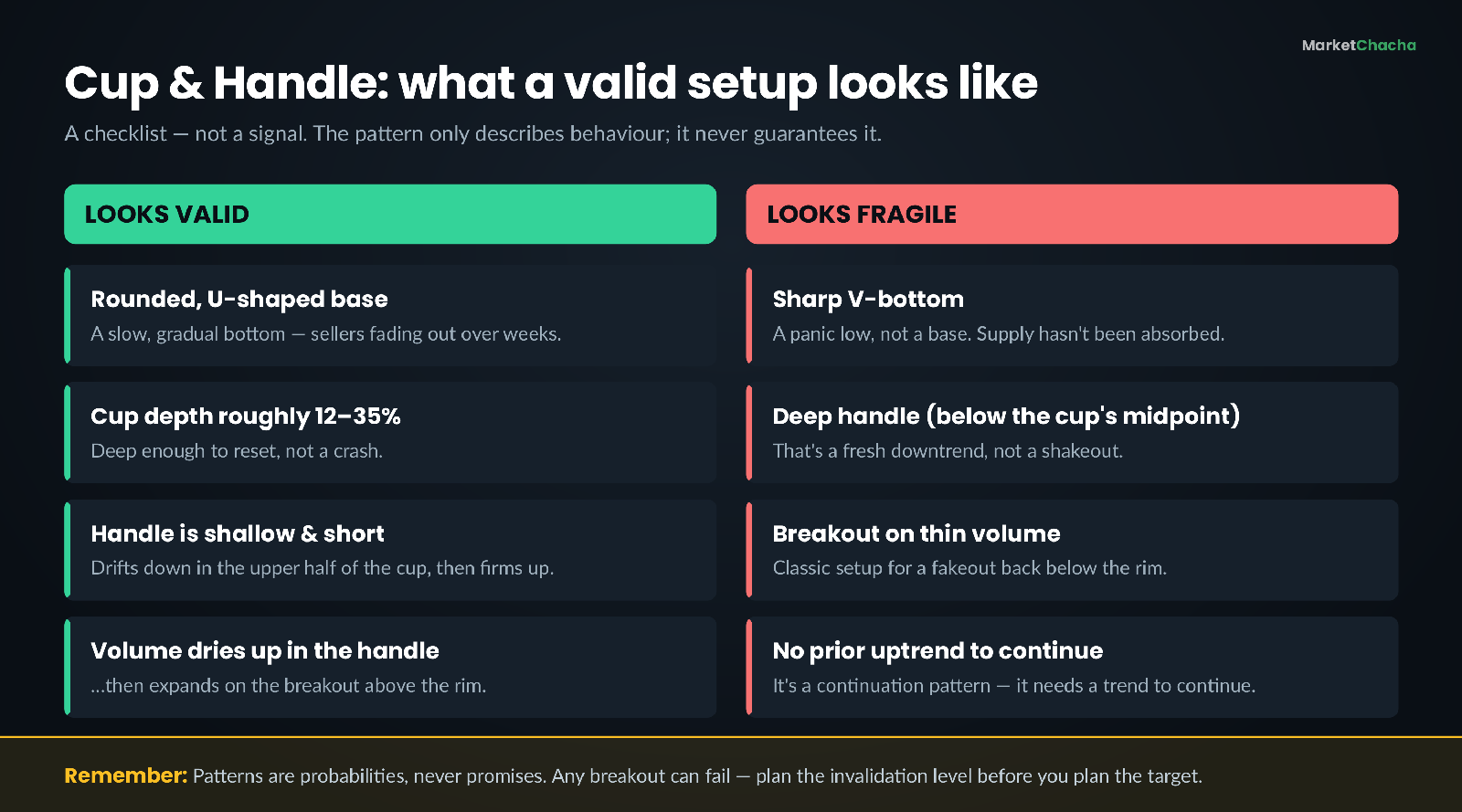
- Depth. A cup roughly 12–35% deep from rim to bottom is typical for a healthy base. Much deeper (say 50%+) and the damage to the stock — and to sentiment — is usually too severe to repair quickly.
- Duration. Real bases take time. On a daily chart, cups commonly take several weeks to several months to form. A "cup" that forms in four days is noise.
- Shape. Rounded, not V-shaped. The bottom should look like a saucer.
- Handle position. The handle should form in the upper half of the cup. A handle that slides below the cup's midpoint is not a shakeout — it is a new decline.
- Volume signature. Volume typically shrinks through the base and especially through the handle, then expands sharply on the breakout. Volume is the pattern's lie detector.
The inverted cup and handle
The mirror image also exists. An inverted (or inverse) cup and handle forms an upside-down, dome-shaped top followed by a small upward drift, and it is read as a bearish continuation — a possible resumption of a downtrend if price breaks below the "rim" support. The logic simply flips: the dome is demand fading gradually, and the small bounce is the last optimistic buyers being absorbed. It carries the same caveats, and in markets where you cannot easily short, it is more often used as an exit or risk-management signal than a trade in itself.
Where the pattern fails
Honesty matters more than pattern-worship here. A few things that are true and worth internalising:
- Breakouts fail often. Price clears the rim, sucks in buyers, then falls back below it. This is a fakeout, and it is common enough that many traders require a close above the rim (not just an intraday poke) plus above-average volume before treating the breakout as real.
- Pattern recognition is subjective. Two competent analysts can look at the same chart and disagree about whether a cup exists. The pattern is far more obvious in hindsight than in real time — this is called hindsight bias, and it is the single biggest reason back-tested chart patterns look better than lived ones.
- Context beats shape. A textbook cup and handle in a stock with collapsing earnings, or during a broad market drawdown, is far weaker than the same shape in a healthy business in a strong tape. The chart is one input, never the whole thesis.
- There is no fixed success rate. Published "win rates" for chart patterns vary enormously depending on the market, the timeframe, the entry rule and how the researcher defined the pattern. Treat any confident-sounding percentage with suspicion.
Common mistakes beginners make
- Seeing cups everywhere. Once you learn the shape, your brain starts finding it in random noise. If you have to squint, it isn't there.
- Buying inside the handle. The handle can keep going lower and turn into a fresh downtrend. Entering "early" removes the one piece of confirmation the pattern offers.
- Ignoring volume. A breakout with no volume expansion is the market shrugging, not agreeing.
- Setting the target but not the invalidation. Deciding where you are wrong — before you enter — is the part that protects capital. The target is the fun part; the stop is the useful part.
- Using intraday charts for a pattern designed for weeks. The behavioural story (supply being absorbed over time) needs time to happen.
- Position sizing as if the pattern is a certainty. Even a beautiful base can fail on an earnings miss or a macro shock.
How to actually apply it
Used well, the cup and handle is less a "signal" and more a structure for thinking. It gives you four concrete things: a level that matters (the rim), a place where your idea is proven wrong (below the handle low), a rough magnitude to expect (the cup depth), and a confirmation cue (volume). That combination is what makes it useful — not any claim about accuracy.
A sensible way to practise: mark up 20 historical charts, identify bases that met the criteria, and note in a journal what happened next — including all the ones that failed. You will learn far more from cataloguing the failures than from admiring the winners, and you will build a realistic sense of how often the shape actually resolves the way the textbook says.
FAQ
What is a cup and handle pattern in simple words? It's a chart shape where a stock falls, forms a rounded bottom, climbs back to its old high, pauses with a small dip, and then tries to break above that old high. The rounded part is the "cup" and the small dip is the "handle".
Is a cup and handle bullish or bearish? The standard cup and handle is bullish — it's read as a pause within an existing uptrend. The inverted (upside-down) version is read as bearish. Neither is a guarantee; both simply describe a pattern of behaviour.
How do you calculate the target of a cup and handle? Measure the depth of the cup (rim price minus the cup's lowest price) and add that amount to the breakout level. If the rim is ₹500 and the cup bottom is ₹400, the depth is ₹100 and the measured target is ₹600. It is an estimate, not a prediction.
How long does a cup and handle take to form? On daily charts, cups usually take weeks to months, and the handle is much shorter than the cup. Very fast "cups" that form in a few days generally lack the slow absorption of supply that gives the pattern its meaning.
How reliable is the cup and handle pattern? There is no dependable universal success rate — results vary hugely by market, timeframe, entry rule and how strictly the pattern is defined, and it is much easier to spot after the fact than in real time. Breakouts fail regularly, which is why traders pair it with volume confirmation and a pre-defined invalidation level.
What invalidates a cup and handle? Commonly: a handle that drops below the midpoint of the cup, a breakout that fails to hold above the rim, or a breakout on unusually thin volume. Each of these suggests supply was never really absorbed.
Educational content only — not investment advice, not a buy/sell recommendation. No guaranteed returns. The pattern description follows the classic technical-analysis literature (notably William O'Neil's work on chart bases); all prices used above are illustrative, not real. Always do your own research.
This article is for educational and informational purposes only. It is not financial advice, investment recommendation, or a solicitation to buy or sell securities. Investing involves significant risks. I am not a SEBI-registered investment advisor. Readers should consult their own financial advisor and conduct their own research before making any investment decisions.
Comments
Join the conversation
Sign in to join the conversation.
Follow replies, add your view, and take part in the discussion.
Sign in to commentLoading comments...